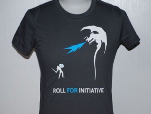
 Straightforward 2-color discharge print we did for an advertising company, complete with a flame-breathing dragon! Straightforward 2-color discharge print we did for an advertising company, complete with a flame-breathing dragon!

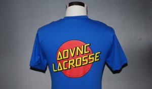
3 colors, plus an underbase to keep the red and yellow inks nice and bright. These were run plastisol, as royal is on the list of garment colors that don’t react well with discharge printing.

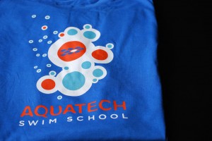
Here’s a great 3 color design on American Apparel Royal blue shirts.
Royal Blue shirts typically do not discharge well,
but we wanted to keep a softhand and bright
colors, so we used what’s known as a discharge
underbase. This means that under all of the top
colors is a layer of waterbased discharge ink that
removes most of the color of the fabric so that
the top colors will be bright.
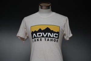
 Here’s a 5-color print on some American Apparel tri-blend Oatmeal tees. These were printed as waterbase, with a very soft hand. Here’s a 5-color print on some American Apparel tri-blend Oatmeal tees. These were printed as waterbase, with a very soft hand.
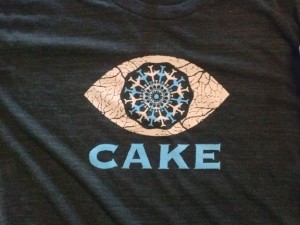
 Three color plastisol, again due to tri-blend fabric. We’ve got some tricks to keep that fuzz down though. Three color plastisol, again due to tri-blend fabric. We’ve got some tricks to keep that fuzz down though.
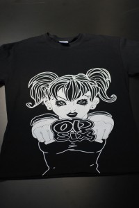
 This here is an oversized white discharge print for Op Six clothing company that extends over the bottom seam and off the edge of the shirt. This here is an oversized white discharge print for Op Six clothing company that extends over the bottom seam and off the edge of the shirt.
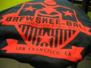
 BrewSkee Ball! We’ve now printed 2 seasons of these BrewSkeeBall
shirts. We use both Gildan and American Apparel
shirts, and a bright single color water based discharge on both.
|
|
 Straightforward 2-color discharge print we did for an advertising company, complete with a flame-breathing dragon!
