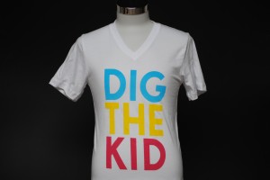
 Here’s a fun colorful print we did for an SF-based band. A trio of neon colors on white v-neck shirts (sunglasses not included). Here’s a fun colorful print we did for an SF-based band. A trio of neon colors on white v-neck shirts (sunglasses not included).
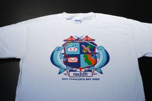
 Here’s a very colorful fun print we did for Reddit. Pretty much speaks for itself, eh? Here’s a very colorful fun print we did for Reddit. Pretty much speaks for itself, eh?

This six color design was a little more involved when printing, and came out beautifully.

Only two colors in this print, though still stands out thanks to the crisp artwork!

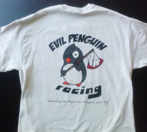
This is a nice, clean print we did for some motorcycle enthusiasts. 5-color print on ol’ trusty Gildan 2000 garments, and yes, we avoided getting on the bad
side of this particular penguin!

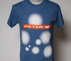
Three color (there’s a white underbase under all of that) print for the band Filter.
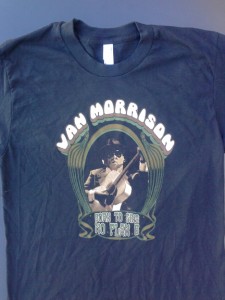
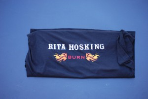
 Six color waterbased discharge print for the man himself. Six color waterbased discharge print for the man himself.
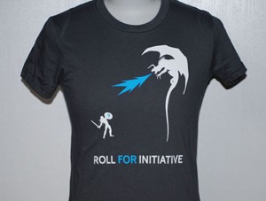
 Straightforward 2-color discharge print we did for an advertising company, complete with a flame-breathing dragon! Straightforward 2-color discharge print we did for an advertising company, complete with a flame-breathing dragon!
 Plastisol for the athletic look on this dude. As much as we love discharge inks, sometimes, they just don’t fit the art. Don’t need a credit card to ride this train… Plastisol for the athletic look on this dude. As much as we love discharge inks, sometimes, they just don’t fit the art. Don’t need a credit card to ride this train…
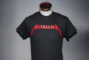
 Metallica! There’s an underbase in there to make sure the bright red stays bright; sometimes simple goes a long way. Metallica! There’s an underbase in there to make sure the bright red stays bright; sometimes simple goes a long way.
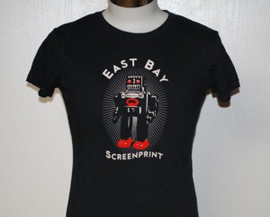
 Mr. Roboto strikes again! Mr. Roboto strikes again!
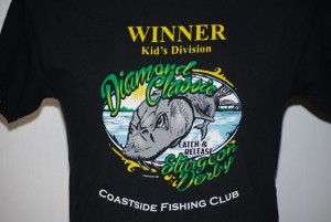
 We print things for this local fishing club from time to time, and this particular shirt was for a youth sturgeon derby event they held. 6 colors with a discharge underbase, and the winning fish even stands out a bit more thanks to the smooth gradients. We print things for this local fishing club from time to time, and this particular shirt was for a youth sturgeon derby event they held. 6 colors with a discharge underbase, and the winning fish even stands out a bit more thanks to the smooth gradients.
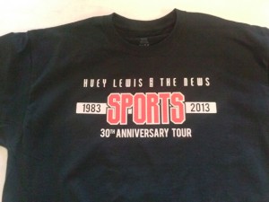
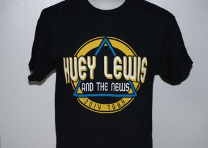
 More Huey Lewis! This fella’s a 3-color print plus a discharge underbase. More Huey Lewis! This fella’s a 3-color print plus a discharge underbase.

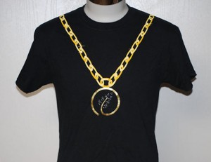
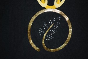
 This print was a bit more complicated than usual. In addition to the gold foil used for the medallion, the leaves in the center are made up of about fifty rhinestones for additional shine. Another interesting challenge was ensuring the placement of the print so that it would appear like a necklace, even going all the way up to the shoulders. Needless to say our client (and us of course) were very happy with how these turned out! This print was a bit more complicated than usual. In addition to the gold foil used for the medallion, the leaves in the center are made up of about fifty rhinestones for additional shine. Another interesting challenge was ensuring the placement of the print so that it would appear like a necklace, even going all the way up to the shoulders. Needless to say our client (and us of course) were very happy with how these turned out!
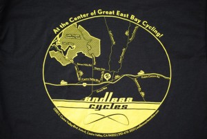
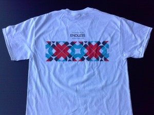
 This design is a recreation of a map pinpointing the location of a local bicycle shop. Not only does the fine detail make for a great-looking print, it also ensures an easy time finding Endless Cycle’s address! This design is a recreation of a map pinpointing the location of a local bicycle shop. Not only does the fine detail make for a great-looking print, it also ensures an easy time finding Endless Cycle’s address!
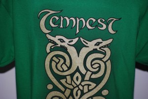
 We’ve printed shirts for the Celtic rock band Tempest for years, and for this run they wanted something a bit more eye-catching. We printed this design in gold shimmer, and added a drop-shadow effect as well. The shirts turned out amazing, making their 25th anniversary tour that much more special! We’ve printed shirts for the Celtic rock band Tempest for years, and for this run they wanted something a bit more eye-catching. We printed this design in gold shimmer, and added a drop-shadow effect as well. The shirts turned out amazing, making their 25th anniversary tour that much more special!
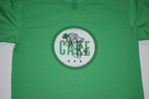
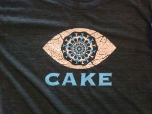
 Another print for the band Cake, this guys is two colors plus an underbase to make sure that “moon” shines! Another print for the band Cake, this guys is two colors plus an underbase to make sure that “moon” shines!

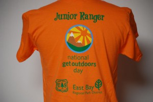
Five color design on Orange Gildan 5000 shirts, this one for the US Forestry Department and East Bay Regional Park District.
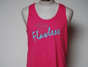
 Here’s a print we did for a local clothing line, two color waterbase on soft fashion tanks. Here’s a print we did for a local clothing line, two color waterbase on soft fashion tanks.

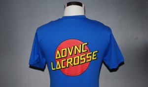
3 colors, plus an underbase to keep the red and yellow inks nice and bright. These were run plastisol, as royal is on the list of garment colors that don’t react well with discharge printing.
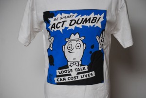
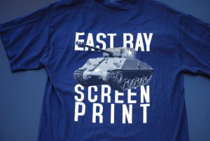
 Five color waterbased discharge designed and printed in house. Going for a 1920’s propaganda feel, the tank literally pops off the garment. It’s awesome. Five color waterbased discharge designed and printed in house. Going for a 1920’s propaganda feel, the tank literally pops off the garment. It’s awesome.
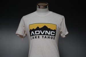
 Here’s a 5-color print on some American Apparel tri-blend Oatmeal tees. These were printed as waterbase, with a very soft hand. Here’s a 5-color print on some American Apparel tri-blend Oatmeal tees. These were printed as waterbase, with a very soft hand.

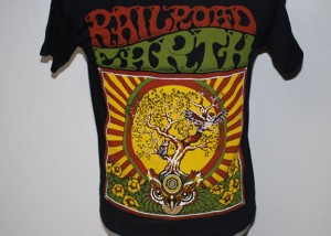
Here’s a 4 color discharge print, this one of a large and colorful tour tee for the band Railroad Earth.
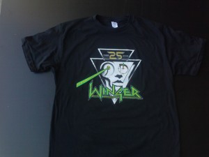
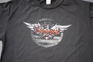
 Winger 25th Anniversary print. Plastisol on this guy, as there were American Apparel tri-blend shirts up in the mix. 6 colors, in house seps ya’ll. Winger 25th Anniversary print. Plastisol on this guy, as there were American Apparel tri-blend shirts up in the mix. 6 colors, in house seps ya’ll.
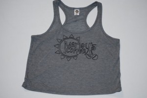
 A nice little print we did on some tanks for a local coffee shop, those that frequent the Farmer’s Market may have even seen these in person. A nice little print we did on some tanks for a local coffee shop, those that frequent the Farmer’s Market may have even seen these in person.
 Three color plastisol, again due to tri-blend fabric. We’ve got some tricks to keep that fuzz down though. Three color plastisol, again due to tri-blend fabric. We’ve got some tricks to keep that fuzz down though.
 Here’s a three color distressed print we did for a Winger reunion promotion, complete with a weathered/vintage feel, waterbased Here’s a three color distressed print we did for a Winger reunion promotion, complete with a weathered/vintage feel, waterbased
discharge inks on Sun Apparel garments. Yeah buddy!
 Little three color discharge from the archives. Dig it. Little three color discharge from the archives. Dig it.
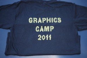
 An interesting 2 color print, this design almost appears 3D on the shirts. Waterbased discharge makes for a super soft print you can’t even feel on the An interesting 2 color print, this design almost appears 3D on the shirts. Waterbased discharge makes for a super soft print you can’t even feel on the
garment. This particular job from the archives was for Google’s Android graphics camp.
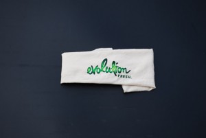
 Another one from the way-back machine. 2 color waterbased sleeve print on Sun natural color garments. If you drink juice this might look familiar. Another one from the way-back machine. 2 color waterbased sleeve print on Sun natural color garments. If you drink juice this might look familiar.
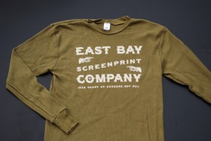
 Another design we printed for ourselves, this design came out very nice and clean. Not always an easy feat on thermal garments! For this we used straight discharge base on Royal Apparel %100 cotton thermals. This allows us to get down into the waffling of the fabric and still maintain a soft breathable print. See if you can find the typo… Another design we printed for ourselves, this design came out very nice and clean. Not always an easy feat on thermal garments! For this we used straight discharge base on Royal Apparel %100 cotton thermals. This allows us to get down into the waffling of the fabric and still maintain a soft breathable print. See if you can find the typo…
 Waterbased discharge again here. 5 colors made this project feasible, whereas with plastisol the color count would have made the project not cost effective. Waterbased discharge again here. 5 colors made this project feasible, whereas with plastisol the color count would have made the project not cost effective.
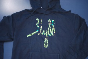
 This three color print came out great, and thanks to the underbase the “jungle” appears even more vibrant! This three color print came out great, and thanks to the underbase the “jungle” appears even more vibrant!
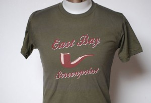
 Here’s a classy print we did for ourselves a while back, 3 color discharge on darker color garments for a vintage-y feel. Here’s a classy print we did for ourselves a while back, 3 color discharge on darker color garments for a vintage-y feel.
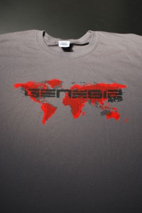
 This print is made up of two different inks. The red background is waterbased discharge, our secret mix that results in a very bright red that washes well. On top of that is black plastisol. We went with plastisol for the black as we wanted the print to have a bit of gloss to it to stand out from the ground, Gildan 5000 Charcoal shirts. This print is made up of two different inks. The red background is waterbased discharge, our secret mix that results in a very bright red that washes well. On top of that is black plastisol. We went with plastisol for the black as we wanted the print to have a bit of gloss to it to stand out from the ground, Gildan 5000 Charcoal shirts.
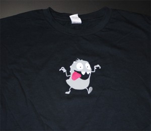
Here’s a nice 4 color plastisol print for an animation company. He literally looks like he’s jumping off the shirt!
 Here’s a neat three color waterbased design we printed recently. We really like waterbased inks as the end result is super vibrant and soft. The ink Here’s a neat three color waterbased design we printed recently. We really like waterbased inks as the end result is super vibrant and soft. The ink
actually becomes a part of the fabric, and once the garment is washed it can’t be felt.

|
|
 Here’s a fun colorful print we did for an SF-based band. A trio of neon colors on white v-neck shirts (sunglasses not included).
