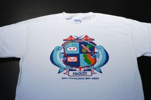
 Here’s a very colorful fun print we did for Reddit. Pretty much speaks for itself, eh? Here’s a very colorful fun print we did for Reddit. Pretty much speaks for itself, eh?
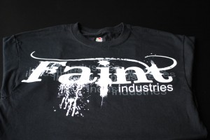
 Blam! Simple 3 color print showing off our waterbased and discharge screen printing. You literally can’t feel the ink on the fabric it’s so soft. Sun 30500 muted colors are our favorite. Blam! Simple 3 color print showing off our waterbased and discharge screen printing. You literally can’t feel the ink on the fabric it’s so soft. Sun 30500 muted colors are our favorite.
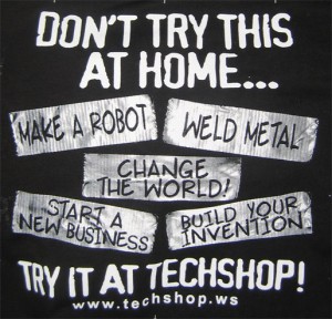
 two color duct tape print We’ve been printing shirts for TechShop, located in Menlo Park, CA, for a number of years now. Every year they exhibit at the annual Maker’s Faire and usually have some cool shirts to bring along. This year they went with a two color duct tape design on back as well as their logo on front. This was an interesting print to produce, trying to recreate the look of duct tape on a t-shirt.
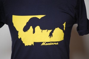
 Super soft custom dinosaur shirts One color discharge, super soft, so awesome. I mean,
really, check it out. You’ve got a t-rex, you’ve got the
state of Montana, you’ve got the colors of the state of
Montana and you’ve got a super soft print that can’t
be felt. If this was to be executed with plastisol you’d
have a big shield of sweaty plastic slowing you down
getting eaten by a t-rex. Sorry about your plastisol luck.
Designed by the totally rad “Dino” Danny Anduza.
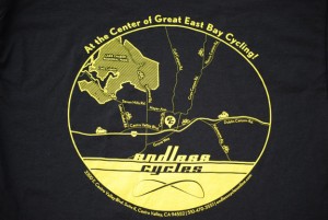
 This design is a recreation of a map pinpointing the location of a local bicycle shop. Not only does the fine detail make for a great-looking print, it also ensures an easy time finding Endless Cycle’s address! This design is a recreation of a map pinpointing the location of a local bicycle shop. Not only does the fine detail make for a great-looking print, it also ensures an easy time finding Endless Cycle’s address!
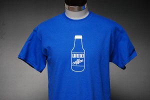
 Super soft waterbased white As much as we are always talking about the benefits of waterbased and discharge printing, they do have
some limitations. One of those is that certain colored fabrics do not react with discharge inks and will
not print properly. Royal blue is one of those colors, and if we were to print this shirt with standard
discharge white, the end result would be a powder blue print. HIGH SOLID ACRYLICS TO THE RESCUE!
Pictured above is our new super opaque white waterbased ink. This is not a discharge product, and
will sit on top of the fabric as opposed to in it. It does have more hand than a discharge print, but
the feel is super smooth and soft compared to plastisol. It’s really neat stuff and we are one of only
a handful of shops offering it.
This print was a perfect candidate, Berkeley based Flux Coffee ordered several different colored shirts
for their order and one of them was Royal, so we discharged the rest and used our opaque waterbased
white for the royal. Result – perfection. (Good art always helps there too!)

Here’s a great 3 color design on American Apparel Royal blue shirts.
Royal Blue shirts typically do not discharge well,
but we wanted to keep a softhand and bright
colors, so we used what’s known as a discharge
underbase. This means that under all of the top
colors is a layer of waterbased discharge ink that
removes most of the color of the fabric so that
the top colors will be bright.
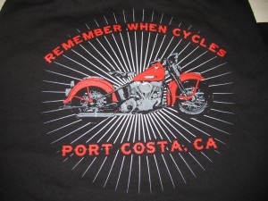
 Remember When Cycles Shirts Steve, the owner of Remember When Cycles, Port Costa California, contacted us to produce a design for his new business. We came up with the image pictured above, and Steve loved it. He had us print it on our Heavyweight shirts, as we all know how tough those bikers can be.
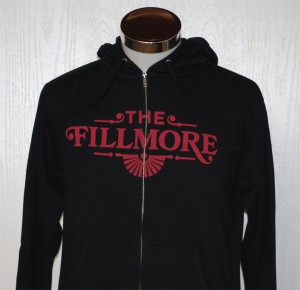
 Single color discharge print across the zipper Here’s a single color discharge print across the zipper for the Fillmore. Pretty neat!
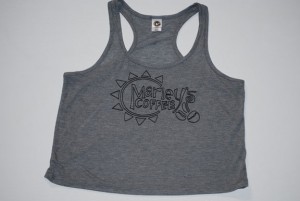
 A nice little print we did on some tanks for a local coffee shop, those that frequent the Farmer’s Market may have even seen these in person. A nice little print we did on some tanks for a local coffee shop, those that frequent the Farmer’s Market may have even seen these in person.
 While this print is about a year old, it really represents the colors of that time, NEON!!!! This shirt is for the Exploratorium, which if you’re a Bay Area native, needs no further explanation. While this print is about a year old, it really represents the colors of that time, NEON!!!! This shirt is for the Exploratorium, which if you’re a Bay Area native, needs no further explanation.
 This is a 2 color print for a local clothing line. We used plastisol for this print as it was going on a bunch of different colored shirts, some of them non-dischargeable. This is a 2 color print for a local clothing line. We used plastisol for this print as it was going on a bunch of different colored shirts, some of them non-dischargeable.
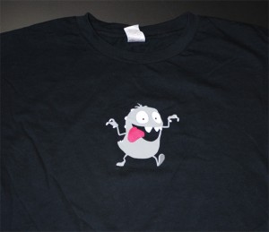
Here’s a nice 4 color plastisol print for an animation company. He literally looks like he’s jumping off the shirt!

Yet another oversized waterbase/discharge
(noticing a trend?) print for an MMA clothing
line. Simple 2 color on Alstyle/AAA shirts.
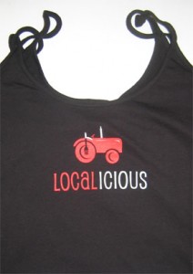
 Localicious Tank Tops 2 color screen printed design on Anvil 325 spaghetti strap tanks.
Good design and a judicial use of colors makes for exciting and inexpensive shirts.
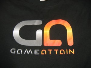
 Four color print for Game Attain East Bay Screenprinting recently printed these shirts for Game Attain. This particular print is a good example of halftoning used for gradient and fade effects in screen printing. This is an area that other printers often struggle with, but we’ve got it down. On this particular screen print, we used a 355 mesh screen that allows for very fine detail to be held. 65 Lines Per Inch means that even up close, the individual halftone dots can be hard to see.
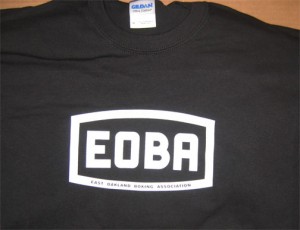
 East Oakland Boxing Association We printed these shirts for the East Oakland Boxing Association. A simple clean white print on Black and Kelly Gildan 2000 shirts. The bottom text is reversed out and smaller than 10 point, and we held the detail just fine.
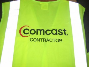
 Printed Safety Vests We recently screen printed these safety vests for a company that does contract work for Comcast Cable out of the South Bay, near San Jose . They went with a 2 color logo on our green Economy Safety Vests.
|
|
 Here’s a very colorful fun print we did for Reddit. Pretty much speaks for itself, eh?
